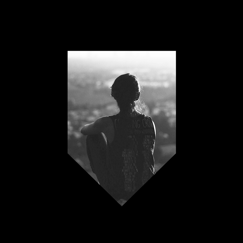
The Pursuit is Happiness is a motto I came up with while living in San Francisco back in 2013. It serves as a constant reminder to stay in the present and find joy in the process.
My good friend Phil Sanders got in touch with me in 2017 about creating a piece of art in Citizen Supply that brought this motto to life. I couldn’t turn down the opportunity to get this message out there. The mural was installed at the end of 2017 and can be found inside Citizen Supply at Ponce City Market in Atlanta, GA.
’The Pursuit is Happiness’ resonates strongly with most individuals, and specifically the dreamers of the Atlanta community. This mural has quickly become a city landmark and destination for thousands to take photos and embrace their individual journey - their pursuit.
assembly is a temporary structure company that offers a kit of temporary and custom designed structures for experiential activations, festivals, and sporting events. Assembly creates temporary spaces that leave lasting impressions and inspire designers to rethink the possibilities of short-term space design.
Project Type: Naming, Identity Design, Web Design, Illustration
Role: Design Direction + Lead
Agency: Public School
Design team: Ariel Aurellano + George Sciourius
Motion: Fern
2018 Mercedes-Benz Pebble Beach Concours d’Elegance
Mercedes-Benz has NEVER backed down from a challenge, starting with the original and most famous (and misguided) of them all: “I believe in the horse. The automobile is nothing more than a transitory phenomenon.”
Benz and Daimler set out to demonstrate to people the benefits of motorised travel over the tried-and-tested horse-drawn carriage. And one of the key benefits, as all automotive pioneers knew, had to be speed. The motor car only had a real chance in the market if it could get its passengers to their destination quicker than a horse. They proved that in spades.
But it was far from the last time the team from Stuttgart would ever be challenged.
Go faster than a plane.
Be lighter than 750 kg.
Sure, it’s fast. But how about luxurious?
One after another — be it from the public, from critics, from race fans or from Mercedes-Benz itself — the challenges came. And, wouldn’t you know it, the conquering continued.
Discover the amazing feats … the broken barriers … the I-can’t-believe-they-pulled-it-offs … even accept the challenge to show us what you’re made of on a replica Laguna Seca slot-car track.
All at Pebble Beach Concours d’Elegance in 2018.
Creative Agency: Public School
Role: Design Director – branding, digital, event creative
Spatial Design + Fabrication: Czarnowski + Assembly
Photography: Sean Metcalf
The mission of Adam’s Camp is to realize the potentials and develop the strengths of children and young adults by bringing together individuals and families with professionals and volunteers to collaboratively provide customized, intensive therapy, family support, and recreation in a camp environment.
Adam’s Camp envisions a world where children and young adults with special needs and their families are empowered with the courage, hope, skills and tools for a lifelong journey of realizing potentials and developing strengths.
Role: Creative Direction, Design, Illustration
Some of my favorite logos I have designed throughout the years. Clients ranging from small business to side projects, corporations to television.
In 2016, I moved from San Francisco to Atlanta for the opportunity to help create and develop a fresh new creative agency, Public School. Part of this process was developing the brand identity for a completely new company and leading the design direction for all of the brand’s applications & channels.
Public School is a multidisciplinary creative agency offering services in strategy, creative, design, and production. Just as people go to public school – the educational institution – to learn who they are, where they fit in and how to best succeed in the world, brands go to Public School – the creative agency – to learn who they are, where they fit in and how they can best succeed in the world. Public School exists to help brand’s reach their greatest potential.
Their differentiator is in the unique and diverse backgrounds throughout their talent and the magic that results in the collaboration of those diverse, talented minds. The identity design needed to celebrate this diversity, inclusion, and creativity all while showing off our attention to design and detail while appealing to our target clientele.
Role
Design Direction, Creative Lead, Design
Collaborators
Ariel Aurellano – Design
Click here to view official Brand Identity Guideline
Design + Direction: Sean Metcalf
Animation: FERN
Project created for Public School to bring their design tenets to life.
This 35ft mural was designed and installed for the creative agency, Public School. Located on the 4th floor in West Side Provision District of Atlanta, the mural was inspired by one of Public School’s driving brand tenants: “All Walks of Creative Life.”
Conceptually, I surveyed the office “who inspires you?” The results were illustrated and installed on the wall - the likes of presidents, musicians, comedians, writers, athletes, and more. The mural is designed to inspire those that pass by it each day, while reflecting the diverse creativity that thrives at Public School.
Role: Design, Illustration, Direction, Installation
Client: Public School
*Collaborative install through the friends and employees at Public School.
Photography: Katie Bricker
Celebrating the 50 years of Mercedes-AMG at Pebble Beach Concours d’Elegance.
Since ’67, AMG has found itself at the pinnacle of performance. At the apex of achievement. The top of the racing pack. And in the dreams of those who love pure, unadulterated power. This is not by accident. It’s not by some random stroke of luck. Instead it’s a relentless passion for Driving Performance — whether on a closed track or a wide-open highway. Our engineers. Our designers. Our fans, even … demand nothing less. We take this thinking into our experience design. Not only will our Pebble Beach guests walk amongst the giants and learn about the legends — from the AMG Mercedes 300 SEL 6.8 to the X1 Drivetrain — they’ll also get their own chance to be a part of the last halfcentury’s most dominant family.
The Official AMG 50 Course
Guests can sign up to race in the official AMG 50 race. The track is a replica of Laguna Seca, the home course of Mercedes-AMG Driving Academy and another favorite destination of race fans. The exciting track design dazzled racers and guests alike, as they watch model AMGs speed through Star Lounge. Guests could follow their stake in the competition through the digital leaderboard and win daily prizes.
In addition, there were several digital experiences that allowed guests to design their own AMG 50 poster, learn the history of Mercedes-AMG, explore the vehicles in the space, and get insider knowledge to the F1 Concept Drivetrain.
Role: Design Director – branding, digital, event creative
Creative Agency: Public School
Spatial Design + Fabrication: Czarnowski + Assembly
Photography: Eric Larson (MB Social) + Sean Metcalf
Art Direction + Design: Sean Metcalf
Illustrations + Animation: Odd Fellows
Engineer: Isaac Gierard
Agency: JUXT
Challenge: How do we simplify and showcase Cisco's IOE technology in an engaging way?
Solution: Let people discover IOE technology in action – working live in Las Vegas through a beautiful, immersive IOE experience.
Full marketing website redesign + visual identity exploration for the Radiant Earth Foundation.
Accessible to anyone, anywhere, anytime, Radiant Earth Foundation's platform helps people discover the vast resources of Earth imagery and tools for new solutions, discoveries, and innovations.
Role: Design Lead (Brand, UX, UI)
*Radiant Earth did not have an established brand guideline (with exception of a logo) prior to this project. Consequently, this project was a major effort in establishing the visual guidelines across marketing communications.
Credits
Role: Art Direction, Design
Agency: JUXT
Client: Plantronics
Objective
Within Plantronic’s newly constructed Executive Briefing Center, Gensler and JUXT partnered to create an interactive installation as innovative as the company's history. Our goal was to take over 60 years of history, and create a beautiful experience that would attract, excite, and educate visitors on the company's rich history.
Solution
Spanning 18ft by 5ft tall, we created an interactive installation that depicted the company's history in an extravagant yet delightfully simple experience. The design of this experience considered many different variables – including hardware, multi-user cases, animation, and most importantly, simplicity.
Installation Layout
First, we vertically oriented 7 LCD Panels, and challenged ourselves to seamlessly integrate hardware within the design. Putting the user first, we decided that each panel would feature its own personal experience. The first 6 panels individually highlighting decades from 1960 - 2010. As the user progresses through history, they arrive on what we call the "NOW+" section. A section that pays off the company's history by highlighting Plantronics' stories of today.
Decade Explore
Each decade circle contains historical stories and content for that decade. The user taps a circle, and then can explore the many different achievements and events within that decade. By using the radial navigation, the user can read stories, view images, and watch video content for every event within that decade.
Timewave
Inspired by the sound wave and fluid motion of time, we designed the "Timewave." This element ties all of Plantronic's history together. As a user approaches the wall, the wave reacts to their presence and vibrates in frequency. Additionally, the wave animates through 5 different colors; each color representing a pillar of the company's standards.
Limited gold foil, letterpress print and horween-leather patch. Created in support of "The Pursuit" project's IndieGoGo campaign.
--
Role: Design, Art Direction, Photography
Designed and illustrated in collaboration with Nashville artist, Brian Wooden and leatherworker, Mika Becktor.
Celebrating the journey, not the destination.
It's the journey - the daily pursuit, where we find our happiness. Take delight in your journey, love each day, and inspiration will find you at every corner. The Pursuit is Happiness.
Print Specs:
9"x12"
Letterpressed, gold and white foil print on black, French Papers. Designed, milled, and printed in the USA.
Printed by Weekend Press
Jacket Specs:
Lasercut on California Horween leather by Mika Becktor. Handstitched on a vintage, American-Made Levi's jacket circa 1970's.
In May, 2011, a school project and a vision for a better America was published on Behance for the world to see. The eagerness to reunite America and the positive response that came from the Behance community had shed a new light on a whole new opportunity. Young&United could be more than an idea – more than a dream – Young&United could be a reality.
Young&United is a movement inspired by the ideals that made our country so great - Creativity. Optimism. Grit. As artists, designers, developers, photographers, writers, musicians, and friends, we've come to together to resurrect these American ideals and stand together as a new generation. Young&United was funded on Kickstarter in 2013. Recently in 2019, the brand has taken a pause to explore new possibilities in preparation for a greater return.
Role: Co-founder, Creative Direction, Design
Role: Design, Ideation
Agency: JUXT
-
Challenge: We have 20,000 unfamiliar people in a large room. How do we get them to break the ice and develop new friendships?
In 2014, Cisco came to JUXT for ideas on their annual, GSX Conference. Being that the conference was in Vegas for the first time in years, it only made sense to do it big. Our goal was to create a cutting edge experience that would facilitate introductions between attendees and equally reflect the innovative frontier that Cisco was pursuing. Also living up to the even theme: “Be Bold.”
The big idea: Human pong.
One of Cisco's number one goals for the GSX Conference was for attendees to get to know one another. They wanted GSX to inspire new, meaningful relationships that would in turn, encourage collaboration in their careers and professional growth.
So how do you help break that ice?
Give attendees something fun to experience together, that they never have before. Create memories, excitement, thrill, teamwork.
The primary GSX attendee was a Cisco sales person. This personae included an individual that is typically pretty competitive. We wanted to embrace that quality, by creating an experience around competition and teamwork. From that point, it naturally made sense to create some kind of game, that would involve teams and competition (much like their day to day work!)
The idea of pong came from answering the question "What's the simplest game for newcomers to get the hang of, and quickly enjoy?" Also, the visual design of pong worked really well within the hardware constraints of this project. A short throw projector, illuminating a 15x15ft transparent screen, comes at a pretty low resolution. By embracing the lack of resolution offered, we chose to create atari-like, pong graphics a la 8-bit design.
Gameplay
Connect challenge was designed to accommodate up to 8 people – 4 teams of 2. As players walked onto the floor, the game recognized them through each attendees RFID badge. An attendee's RFID badge contained their registration data: location, age, industry, vertical, years at Cisco, etc. When all players walked on the floor, the game would then pair them into teams based on their similarities. For example, two players were from the same state or sold the same Cisco product would be paired together. Also, the game would intelligently recognize the number of players on the floor and adapt its design to fit 2, 3, or 4 teams.
Each team of two was given a paddle. The paddle would move in the direction that the teammates walked towards, together. Keyword: together. The paddle would only cooperate when the teammates were moving harmoniously. If one teammate ran one way, and the other ran the other way – the paddle would fail. But when the teammates moved together in the same direction.. voila – the paddle would cooperate and the team was practically unstoppable. This experience was designed to encourage teamwork. Teams could only win when they worked together. If teams did not work together, they would surely lose.
Like a traditional game of pong, when you score on the opponents goal, you get a point. To speed up play (more than 20 thousand attendees were ready to play), when a team scored on another team, that team was eliminated. The last team standing was reigned champion.
The Connect Challenge was a massive success. Multiple people would come back again and again to play and meet new colleagues. Not only was it the main attraction and talk of GSX, but hundreds (if not thousands) of new relationships were formed.
This was by far one of the most challenging yet rewarding projects I have worked on to date. Everyone involved in the creative process of this project (including our client) played a crucial role in the success of Connect Challenge. It took every ounce of grit and tenacity to make this project happen in just 3 months.
Team:
JUXT (Creative Agency)
Shane Diver (Create Direction)
Vinicio Vazquez (UX)
Sean Metcalf (Design + Art Direction)
Dani Morales (Design)
Bryan Hawkins (Design)
Snibbe Interactive (Engineering)
Branding Design, Illustration, and Web Design for my wife and I's wedding on October 10, 2015.
Role: Design, Direction, Illustration
Art Direction: Sean Metcalf
Animation: Markus Magnusson
Design: Markus + Sean
Agency: JUXT
Client: Confidential
Objective: come up with a series of 6 greetings that online users could exchange between each other. Due to a large international audience, greetings needed to be gender sensitive towards all ethnicities.
Solution: rather than a standard "facebook like" button or a relative pat on the back, we wanted to create something that the recipient would be thrilled to receive. Something that could be so fun, that the receipient would want to send one back in exchange. So, we decided to create a series of 6 short animations that demonstrated the following greetings: High Five, Hand Shake, Bear Hug, Jazz Hands, Fist Bump, and Bow. A diverse range that could be understood by a variety of ethnicities.
A series of illustrations and designs that I created for Young&United.
Role: Design, Illustration
Levi’s Vintage Clothing is not just apparel, but a collection of historical artifacts that celebrate the last 141 years of Levi Strauss & Co. and America.
We told the story of Levi's Vintage Clothing through a timeline interaction site showing off the product as pieces of art hung in a museum rather than just grid wall. Each time period reflected important cultural ties that no other brand can say heritage like Levi's.
We incorporated Levi.com main header into this site allowing for shopability across all major Levi brands while giving LVC a unique look and style in their own site platform.
Role: Design / Concept Development
Client: Levi's Vintage Clothing
Agency: AKQA
Role: Design, Art Direction, Branding
Partner: TZX2, Jeff Huggins
Client: WIX, Superbowl XLIX
Objective
WIX + TZX2 was looking for branding design + art direction for the creation of their 2015 Superbowl digital campaign. The idea starred 5 former legendary NFL athletes, who traded in their careers in football, for new careers in business. Each athlete was starting their own new small business, and was using WIX to create their website.
I was responsible for the design, branding, and art direction for NFL athletes Terrell Owens and Franco Harris' website. Each athlete was starting a business that not complimented their personality. Terrell Owens was ready to show the world his very own humble pies. And, as a commemoration to Franco Harris' 1972, Superbowl-winning "immaculate reception" – Franco was now venturing off in a new kind of Immaculate Receptions: wedding planning.
This was hands down the most fun project I've worked on to date.
An interactive concept to create the ultimate team training product that lives on mobile and desktop.
Role: Design, Art Direction
Inspired by an American Spirit of optimism, peace, and progress, Young&United's package design pays respect to the haydays of American Manufacturing and the attention to detail that goes into making Young&United's product line. This sustainable package system makes use of a single sided, one color screen print on recycleble paper. All materials are made here in the USA.
When Young&United was funded on Kickstarter at the break of 2013, our goal was to create a packaging system that show the upmost appreciation for our customer's support. We wanted to create a piece that would surprise our customers and give them something that they could potentially hold on to and not immediately dispose. The result was a success, as many of our customers did exactly that – posting their packaging experience to their social outlets and even asking for fresh, unfolded prints to frame in their home.
Design & Illustration: Sean Metcalf
Marching Stamp Design: Michael Molinaro
Photography: Ben Lebovitz, Sean Metcalf
A tribute to a special case of love. I created this piece as a gift to our friends and newlyweds, Jon & Lily Evans.
While in Los Angeles for their wedding, I noticed the unique love the two had for eachother by the way they gazed eachother's eyes. Inspired by this, I wanted to illustrate a piece of art that could embody that. The use of floral ornament was inspired by the abundance of vines located at and around their home. Additionally, this stylistic direction was intended to symbolize the natural, timeless, and beautiful love that Jon & Lily had for one another.
I began the process by sourcing two profile photographs of the two. I iterated upon numerous thumbnail-sized illustrations until I was comfortable with this execution. From there, I illustrated the piece at a larger scale, using white and gold pens on black 22x30 Stonehenge paper. Additionally, I created a vector, digital copy of the artwork for future reproductions.
Commissioned painting for Rachael Juliette.
Objective
To design a piece that communicates "Work Hard Be Kind."
Solution
When Rachael initially told me about the project, the expectation was far from the solution. I wanted to create a piece that got right to the essence of the message. I knew that I didn't want to digitally create something because that would be too easy. I needed to make something that was hard. Something permanent. Something that would last.
Every design decision tied right to the message. It started with an old piece of wood that I found at a scrap yard. I retrieved the wood block, scrubbed off the years of old dirt that was on it, and painted it with a matte, chalkboard acrylic.
While ideating the design, I wanted the work to convey "kill 'em with kindness." In that the greatest strength comes from being kind to others, so that we might keep working hard. The design needed to feel tough, but loving.
Floral, ornamental tattoos were depicted on the bicep to convey sensitivity through the flexing, tough muscle. "TKO XOXO" is symbolic to knocking them out with kindness. Gold was used on the black paint to depict a sense of royalty, as "Work Hard Be Kind" was Rachael's golden rule.
I could not be more satisfied with the end result. The process of hand painting the letters and illustration was extremely difficult, but I loved every moment of it. Work Hard. Be Kind.
Screen prints available soon.
I was approached by good friend and digital strategist, William Herring about an idea he had. What if we could create a platform that housed all the social content for NYC Fashion Week? So, we rallied a team of strategist, designers, and developers and hit the drawing board.
NYC Fashion Feed is a one stop shop for all social content on the web. It aggregates all social content from Instagram, Twitter and translates it so you can see all the hottest trends and find out which designers are on top.
Role: Direction, Copywriting, Design
Team: William Herring – Digital Strategist // Patrick B Johnson – Digital Strategist // Ben Lebovitz – Design & Art Direction //
A Rebrand of a small, boutique guitar shop in Atlanta, Ga. The objective was to create a new logo, tone, and web presence for the small but renowned guitar store.
Role: Creative Direction, Design
Assistance: Ben Lebovitz - Photography, Art Direction
EN Magazine is a fashion design & culture magazine concept. EN Magazine features the "What's EN" aka "What's In" for today's fashion industry standard and design culture. The project is a collaboration amongst four SCAD Students: Sean Metcalf (Design & Direction), Dru Phillips (Photography), Dylan Shaw (Photography), and Katherine Owen (Fashion Design).
Role: Design, Direction
"Graphic Design is essentially about visual relationships, providing meaning to a mass of unrelated needs, ideas, words, and pictures. It is the designer's job to select and fit this material together and make it interesting. The reason apparently unrelated things become interesting when we start fitting them together.. is that the mind's characteristic employment is the discovery of meaning, The Discovery of Design.
" – Paul Rand
Idea
Braille is quite possibly the most unrelated thing to Graphic Design. The blind
can not see, so why would Graphic Design be relevant then? I took upon the challenge of taking braille (which fully translates Rand's passage in the piece), and relate it to Graphic Design in order to "make it interesting" as Paul Rand puts it. The complimentary-colored circles are used to symbolize a Venn Diagram, essentially taking two unrelated things (Braille and Design) and "fitting them together" as he puts it. Which is why, in the middle you have the relationship:
to Discover Design.
My CV Resume
I was browsing through The New York Times archive over a morning coffee when I got hit with an interesting idea. "Why do all traditional publications look so.. traditional?"
So I took the challenge of taking the formal qualities of a newspaper and translate it into something modern and elegant (but still maintain its authentic quality). It just so happened that this idea could create an interesting resume mailer that I was eager to begin. With twenty weeks of school left for me, this all sounded like a great opportunity to hit the sketchbook.
I consider myself a conceptual designer that loves typography. With that said, wanted my CV to highlight my strengths so I focused on an interactive, conceptual design derived from clean type.
Cover design and illustration I created for the popular novel, Crime And Punishment.
In the story, Raskolnikav undergoes deep mental anguish. He illustrates this strife through the metaphor of a moth circulating a flame. The moth, carrying the guilt and pain he feels, circulates the flame and continues to get closer. Until it gets too close and is no more.
Role: Illustration, Design, Direction
Frequently Asked Questions, 3 Designers
FAQ 3D is a typographic interpretation of Debbie Millman's popular book: "How To Think Like A Great Graphic Designer." Millman's book contains multiple interviews with today's most renowned graphic designers. FAQ 3D features three of those designers: Michael Bierut, Milton Glaser, Paula Scher.
Role: Design, Direction
A typeface, product display, and campaign that I designed in 2011. Using acrylic magnetic pieces, guests can create the entire Tri Face family within the product display. Voila. Let's make type magic.
I love typography.
Here's a collection of some of my favorite lettering projects that I've created.
A responsive portfolio theme that I designed and concepted for funsies. Available on Themeforest soon.
Exploration and adventure is in my blood. Always on the hunt for something new, I took an open mind and a moleskin to San Francisco when I moved out west in 2013. Here are some of my discoveries.
I was invited to design and mix a couple records for Designers.MX
Role: Design, Photo – All imagery shot with my iPhone
This project consists of an identity redesign for Il Pasticcio wine and grill in Savannah, Georgia; including logo, photography, and web design. Il Pasticcio was a premiere Italian dining experience in the heart of Downtown Savannah, except their branding and identity lacked considerably. Lavish interiors and exquisite meals added to a great experience. However, their current identity and branding couldn't tell this story. Unfortunately, this identity system never saw the light of day at Il Pasticcio. The restaurant later went out of business.
Role: Design, Photography, Direction