Commuting through a San Francisco rush hour by bike should be considered an Olympic Sport.

Quiet Hounds Illustration Process
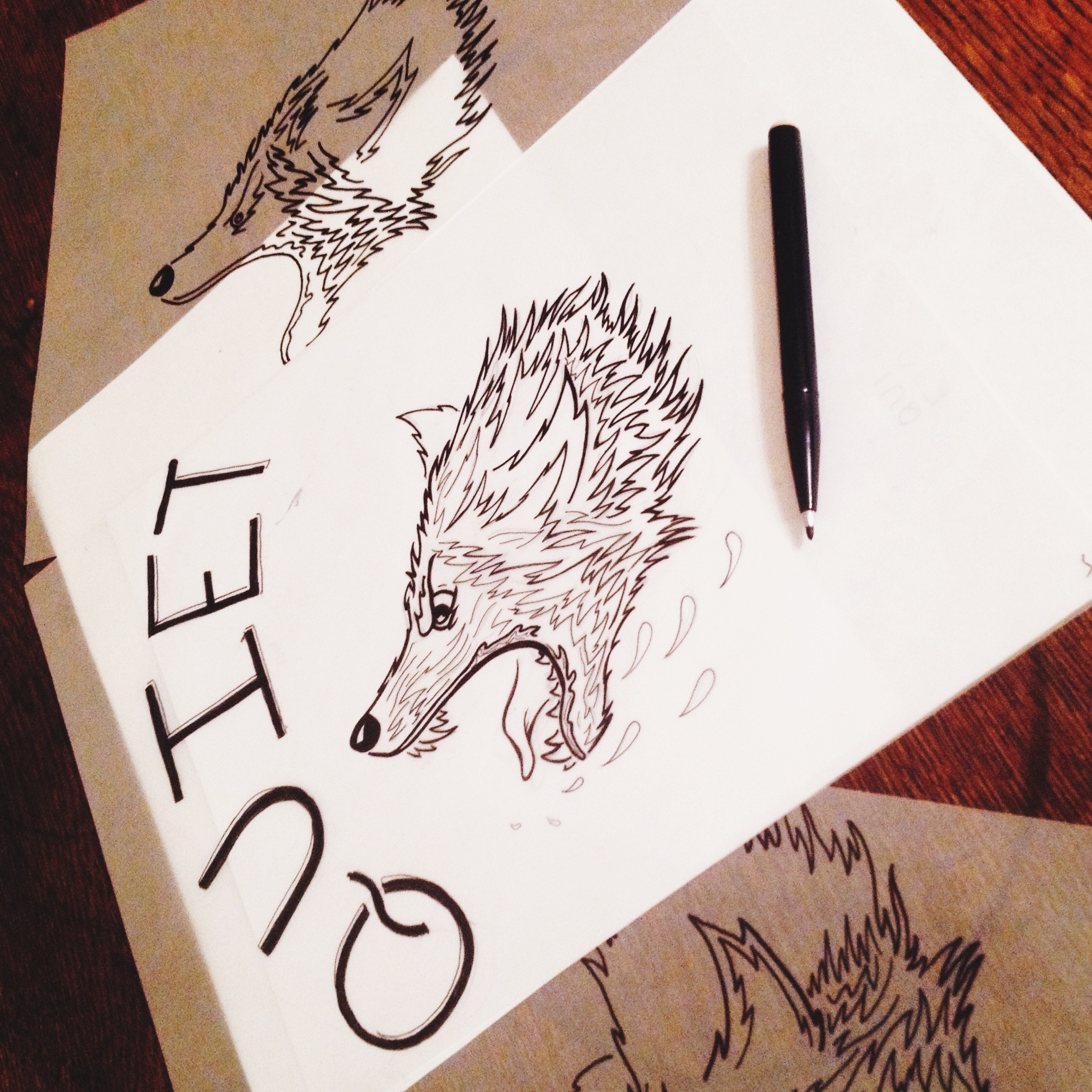
Working on a new and exciting project with Quiet Hounds in Atlanta, Georgia. Quiet Hounds came at me for some apparel/merch ideas for their annual Goat Farm concert. After thinking through a few different directions, I wanted to explore a new illustration technique that may compliment the band's artistic roots and inject some personality. The concept is to highlight a vicious hound with the words "QUIET" on top of it. Creating a nice contrast between a vicious hound being tamed by the words "quiet."
Kicked off these illustrations on a Saturday night with Jimi and friends.
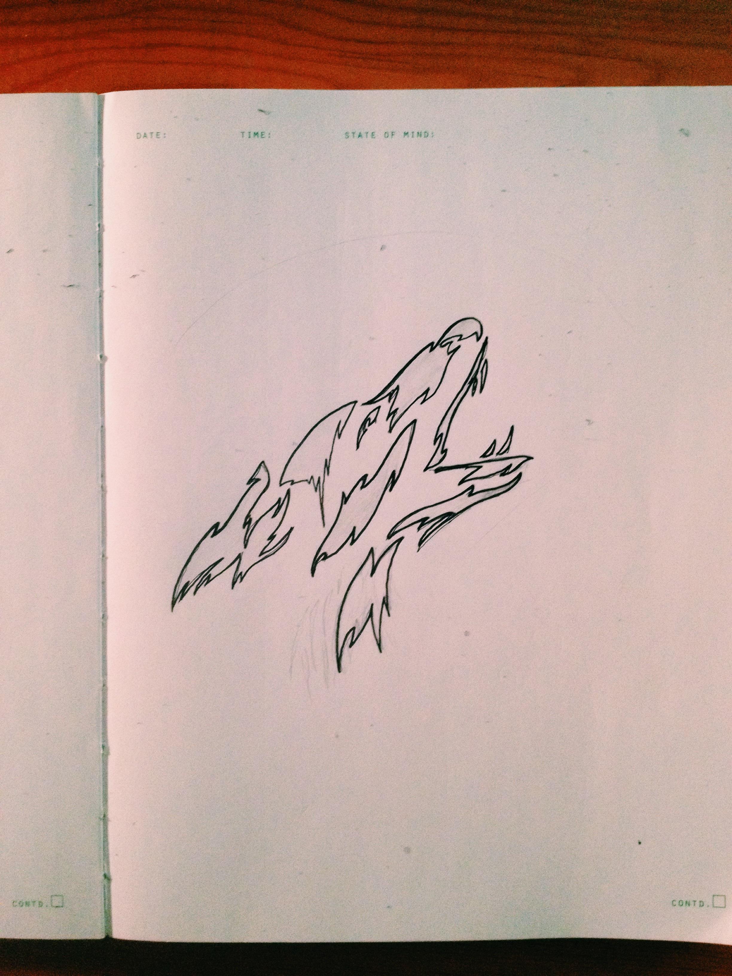

Initial hound illustration. Wasn't in favor of this direction – generally lacked the personality I was looking for.
Original Illustrations. Rough sketch of typography to see how the illustrations matches type.


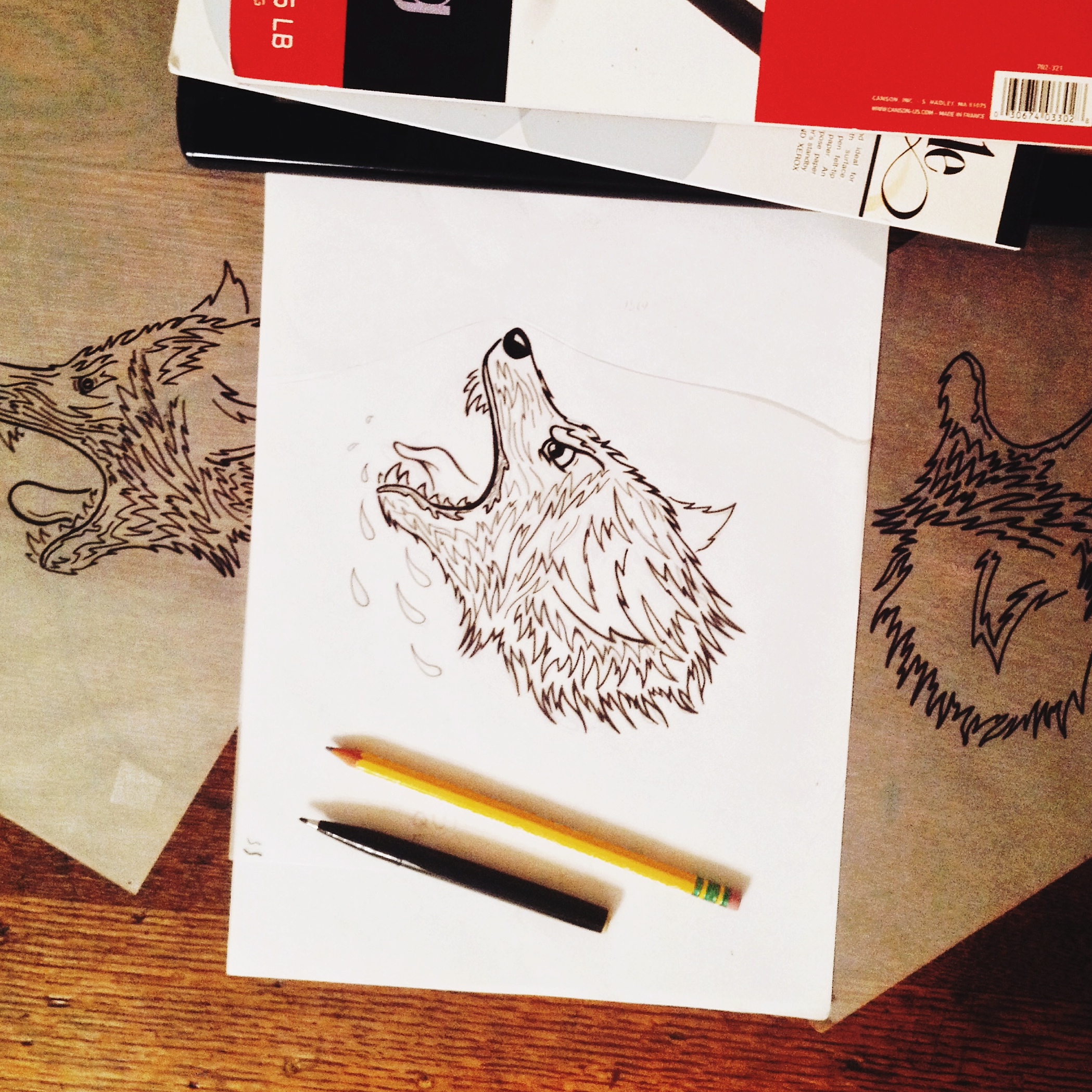
Scanned illustration and bringing into the computer to polish up. Left is original scan, right is progress on the cleanup of the linework. Thinking of inverting the illustration to have more weight on the garment. Interesting in going with a Raglan style tee with dark sleeves.
Motion Collaboration
I had the honor of collaborating with Swedish motion designer, Markus Magnusson on a very fun motion series. We created a set of 6 animations – each telling the story of a congrats gesture – high five, fist bump, jazz hands, bow, handshake, and bear hug. Here's a peak at the high five which was recently featured by Dribbble.
Make sure to check out the rest of Markus' motion work here
Role: Art Direction, Character Design
Agency: Juxt

Process Type
Get yo vector on. Follow up on some hand lettering a few weeks back.

Neon Type
One of my favorite neon signs in the city. Found in Nob Hill.

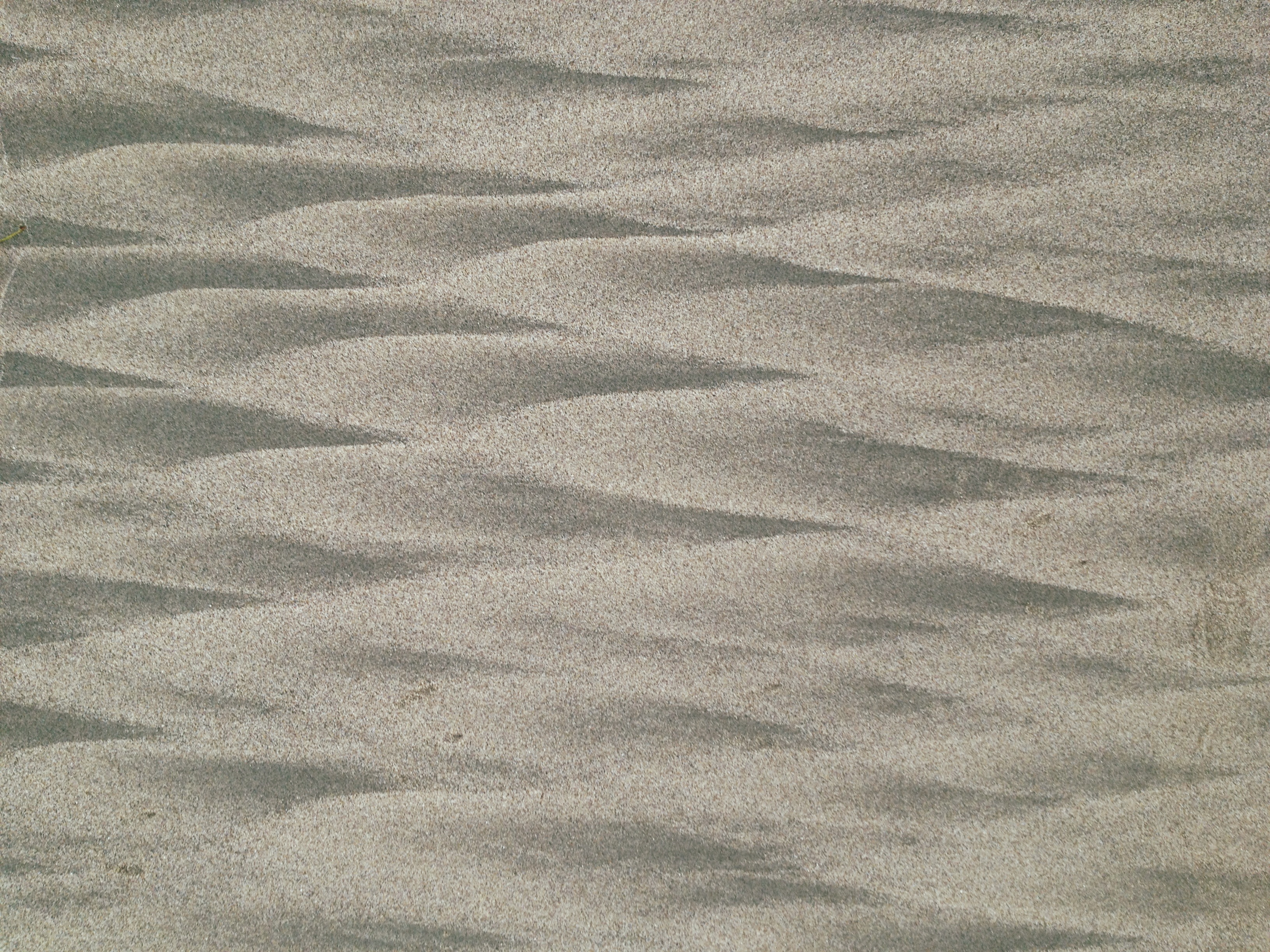
Inspiration - Ocean Beach Sunrise
Morning walk on Ocean Beach. Inspired by this texture I found in the sand. Thinking this would make an interesting pattern design or textile.
Time Tilings by Pablo Valbuena
Site specific interventions created by Pablo Valbuena. In Time Tilings, Pablo takes a physical surface and carefully projects patterns that compliment the natural geometry of the surface.
Beautiful and inspiring work. Hope to see more examples from Pablo and other artists that create a merge between digital and physical.


More Inspired Type
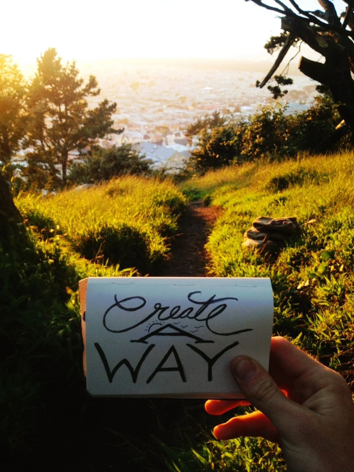
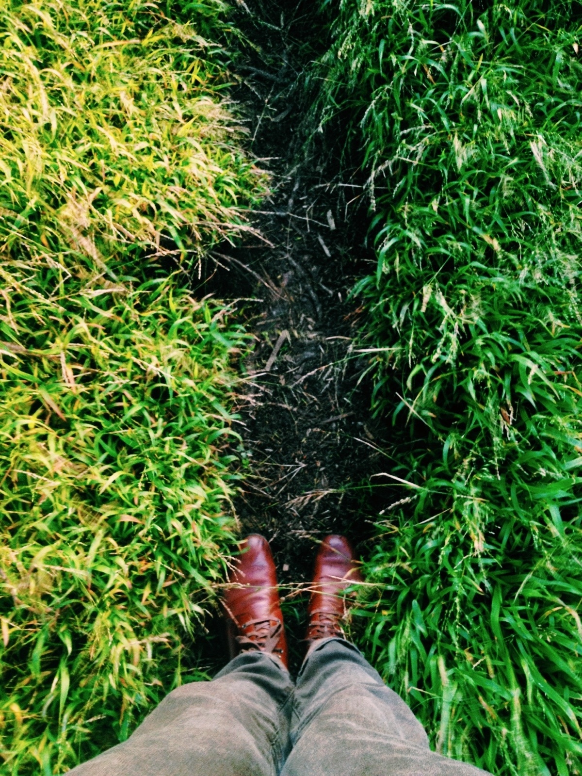
I got off work today and immediately sought out a new adventure. One of my coworkers was telling me about Golden Gate Heights – a park that is just a bit south of Remnants of Sunset where I had my last adventure and less than 2 miles from my home. She promised me it was beautiful and awe inspiring, especially if I happened to catch one of Outer Sunset's rare sunsets (it's not an oxymoron. SF locals know that The Sunset district is often covered in fog and really is The Fogset).
I was in luck. It was a clear brisk night. I hiked up to the top of the park and headed straight into a natural foot-paved path within the tall swaying blades of grass. The view was golden, natural, and authentically perfect. I sat for a bit and began to think.
I'm beyond grateful to be living in SF, but even more grateful at the opportunity that awaits. An opportunity that isn't necessarily called out or sitting my lap. But it is realized. It's an opportunity to be discovered, to be desired, and to be created.
With shaky hands from the chilly San Francisco sunset, I made this:
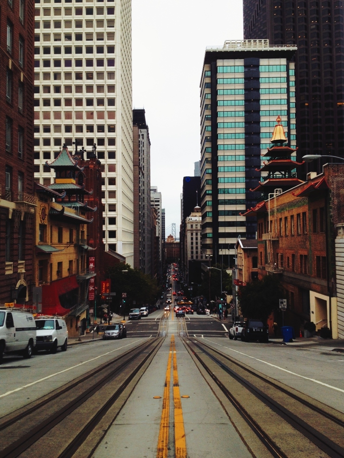
Taken on California St. 8:25AM.
Daily SF inspiration commuting to work.
Type Illustrations
Working on some hand-lettering for the new Young&United website. Time to polish in pixel-land.
