Working on a new and exciting project with Quiet Hounds in Atlanta, Georgia. Quiet Hounds came at me for some apparel/merch ideas for their annual Goat Farm concert. After thinking through a few different directions, I wanted to explore a new illustration technique that may compliment the band's artistic roots and inject some personality. The concept is to highlight a vicious hound with the words "QUIET" on top of it. Creating a nice contrast between a vicious hound being tamed by the words "quiet."
Kicked off these illustrations on a Saturday night with Jimi and friends.
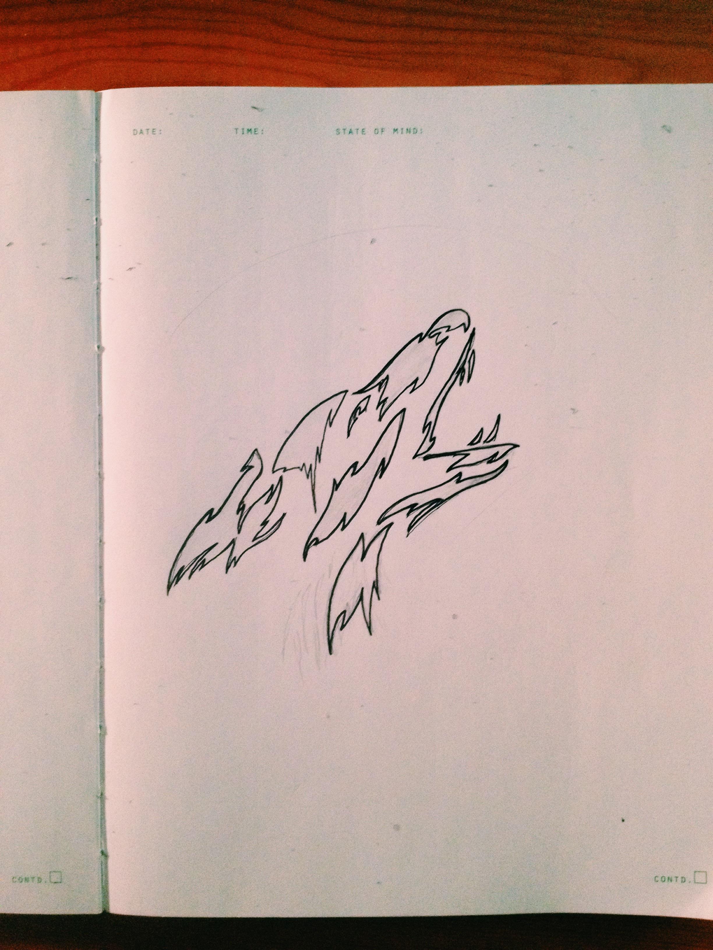

Initial hound illustration. Wasn't in favor of this direction – generally lacked the personality I was looking for.
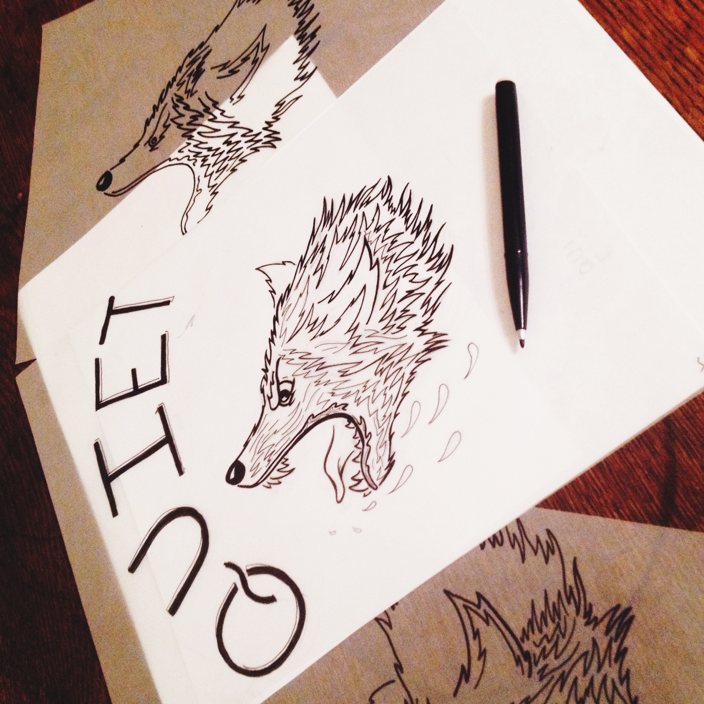
Original Illustrations. Rough sketch of typography to see how the illustrations matches type.


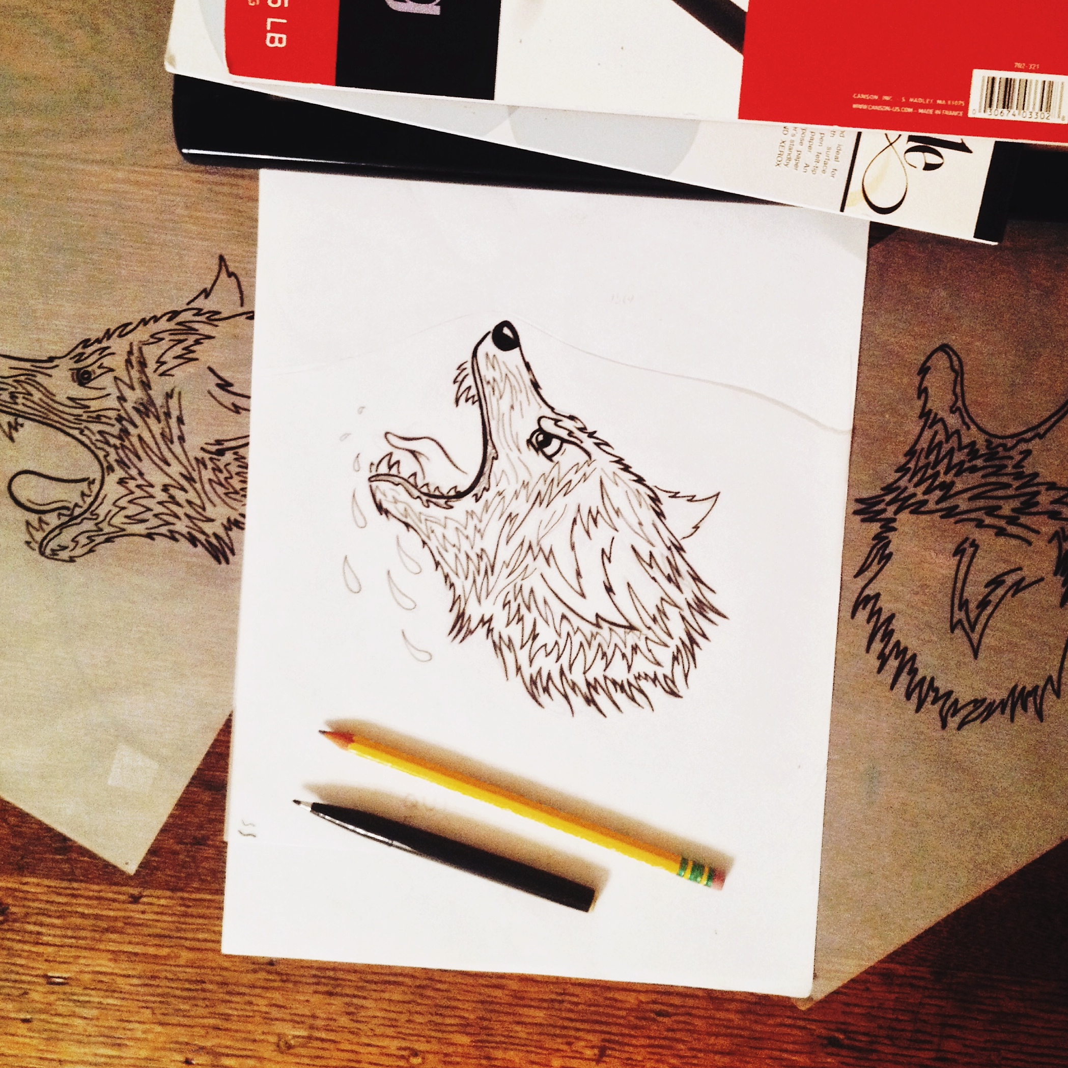
Scanned illustration and bringing into the computer to polish up. Left is original scan, right is progress on the cleanup of the linework. Thinking of inverting the illustration to have more weight on the garment. Interesting in going with a Raglan style tee with dark sleeves.