Process on a painting I was commissioned to create. Work Hard. Be Kind.


Process for JUXT's website.


Type explorations for JUXT's new website.

Young&United Packaging
Starting to piece together the final elements for our Young&United packaging. Excited to submit this one to the Dieline Awards!

2014
Be on the watch.
To be inspired more by the ordinary. To take on fresh eyes. To look at the world anew. To delight in simplicity and smile at the little things. To think outside the box, meaning, to think outside of the pixel. To have a more foolish heart, coupled by a more growing, eager mind. To fail more – a lot more. To be surprised as to what is possible. To be on the watch.

Photo: Brad Lou Tennant
Found Type
Morning walk in the fog on Ocean Beach this morning when I stumbled across this Vintage International Scout. The car was beautiful, but the typography is what really grabbed my attention.

Incredibly thrilled to begin this case study to one of my favorite projects I've ever worked on: Young&United packaging.
Last night, my partner Ben and I got out of work and headed to photograph the packaging. Ben works at an agency that is amazingly supportive of his and I's entrepreneurial spirit – so they granted us their studio space to shoot in. We arrived there in the evening and shot, experimented, and had a blast with this project through the wee hours of the night. Next thing you know, it was 5am. Dang, time flies when you're having fun. Can't to share this project! AHH.

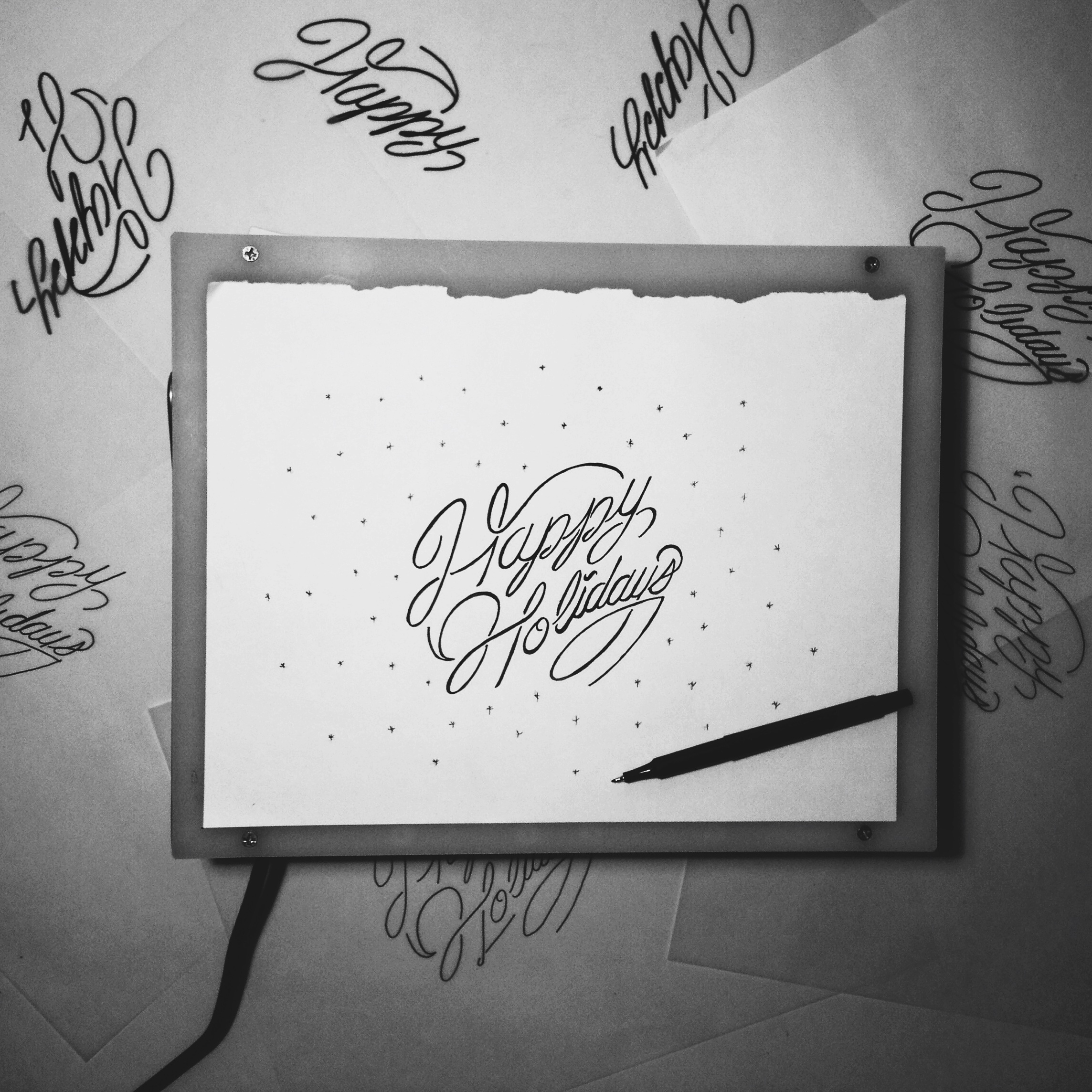
Tis the season for Holiday Card designs.
Here's some design process for JUXT's seasonal holiday card.

The more I create, the more confident I become.
A couple weeks ago, a friend of mine that works at IDEO recommended David & Tom Kelly's latest book, Creative Confidence.
The book targets awareness as to what creativity actually is and that it can be discovered, learned, practiced, and grown by anyone. I have to say that as a creative, the book is a refreshing reminder to why I became a designer and how to become more intentional with our work through design thinking. I'm just a couple chapters deep and am thrilled for what else is packed in the book.

Y&U Packaging Process
From the archives. Case study coming soon!

STAY HUNGRY
After Quiet Hounds decided against this illustration, I wanted to reincorporate it for a new Young&United design.


Give more, live more
Would you be willing to live with less so that others could live with more?

Illustration Studies
Been exploring some illustration styles for a special longboard design project.
Which style is your favorite? 1, 2, or 3.


YBCA Freda
"Who is Freda?"
Taken today at the YBCA.

New Cards
"Simplicity is the ultimate sophistication."
White foil stamp on black, 130lbs Neenah Paper. I'm real excited about these.
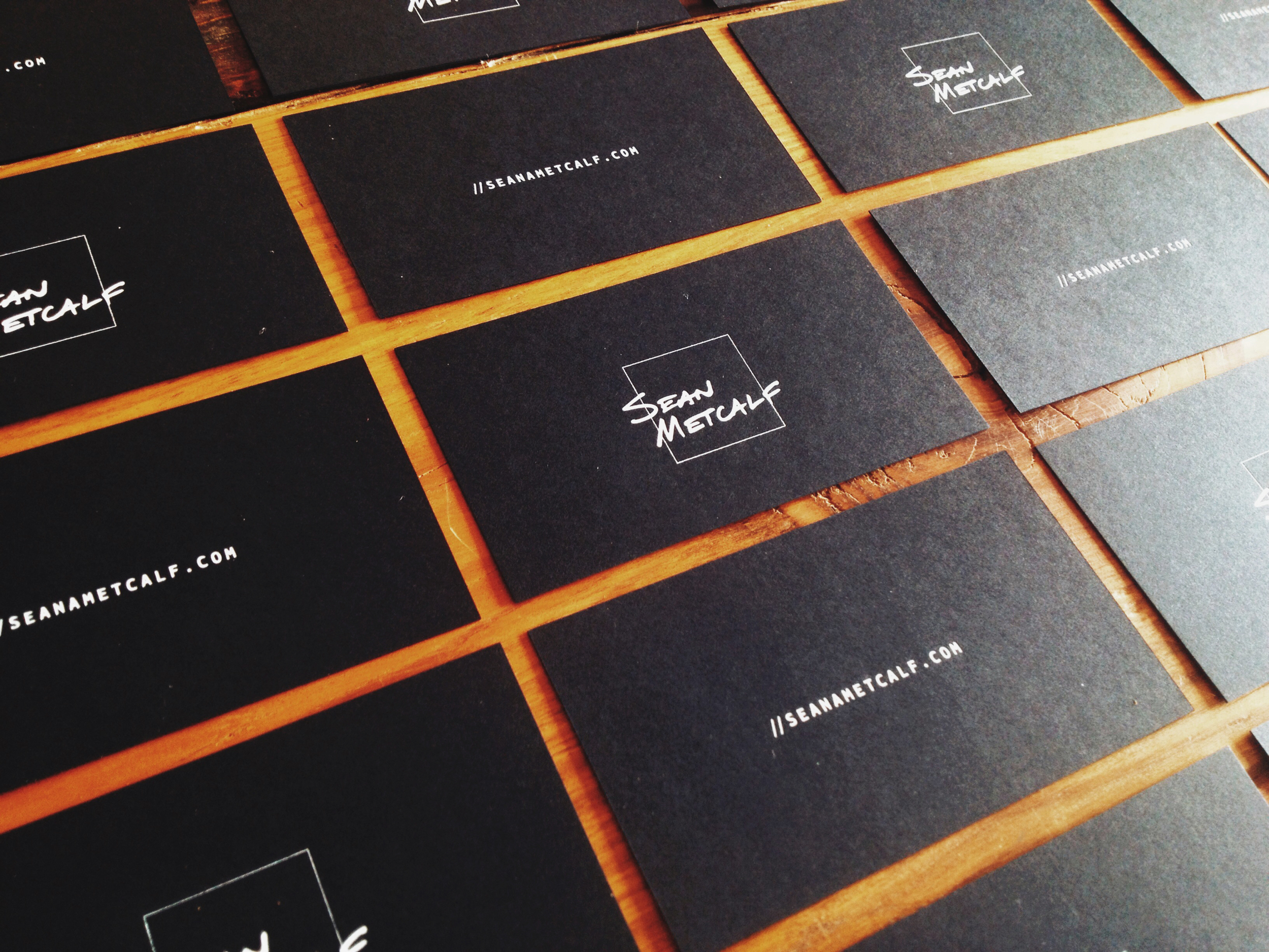

Sean Metcalf, USA
Gallery Show, San Francisco
I had my gallery show in San Francisco last week at San Franpsycho, Divisadero. It was an incredible experience and the support and turnout was great! The process of printing, framing, and being able to hold a photograph is one of the most enjoyable experiences I've had. And for that, I look forward to doing more shows and improving my craft.


Commute Home
Commuting through a San Francisco rush hour by bike should be considered an Olympic Sport.

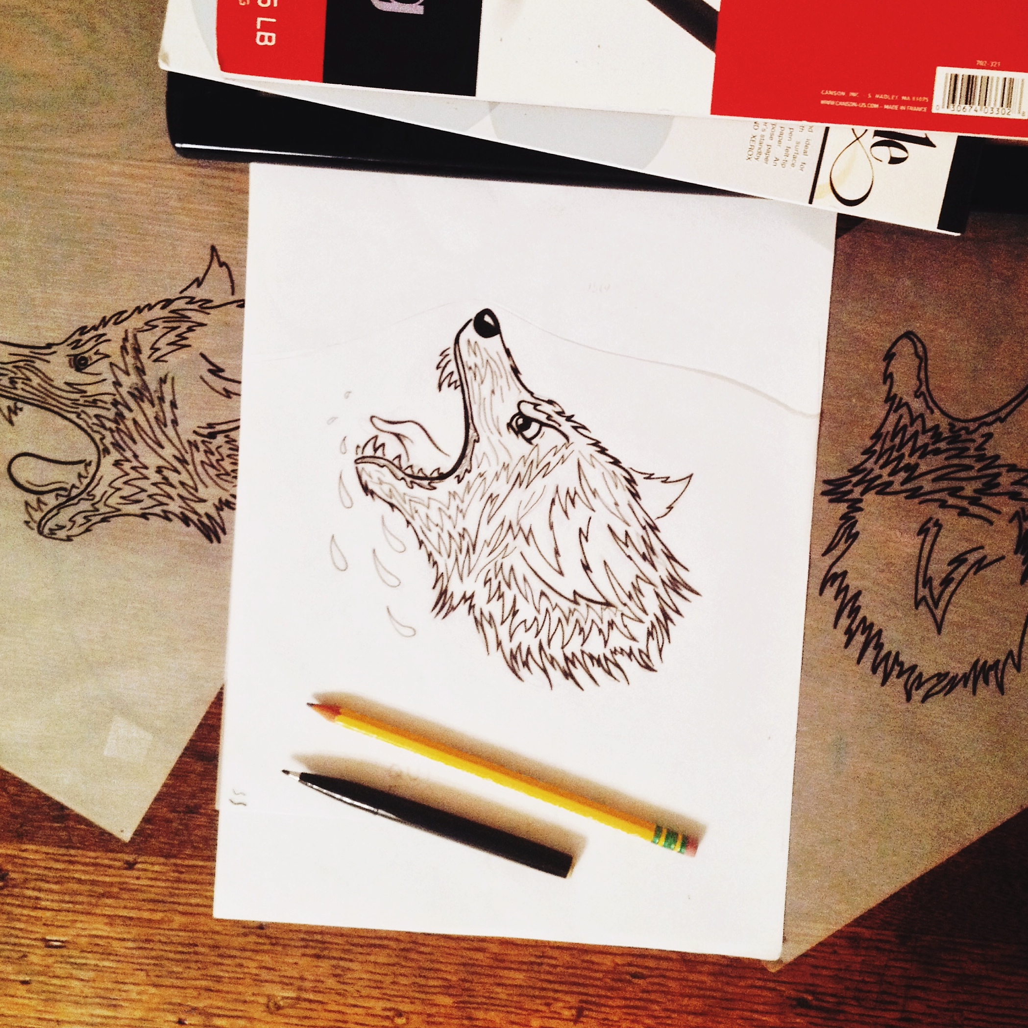
Quiet Hounds Illustration Process
Working on a new and exciting project with Quiet Hounds in Atlanta, Georgia. Quiet Hounds came at me for some apparel/merch ideas for their annual Goat Farm concert. After thinking through a few different directions, I wanted to explore a new illustration technique that may compliment the band's artistic roots and inject some personality. The concept is to highlight a vicious hound with the words "QUIET" on top of it. Creating a nice contrast between a vicious hound being tamed by the words "quiet."
Kicked off these illustrations on a Saturday night with Jimi and friends.
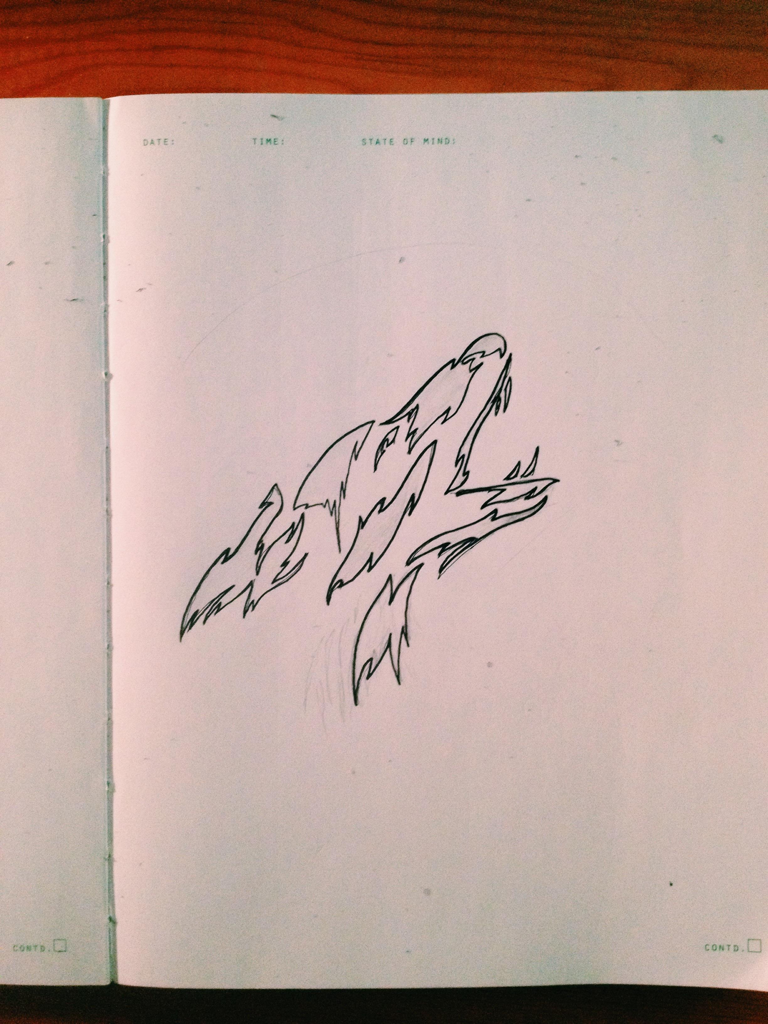

Initial hound illustration. Wasn't in favor of this direction – generally lacked the personality I was looking for.
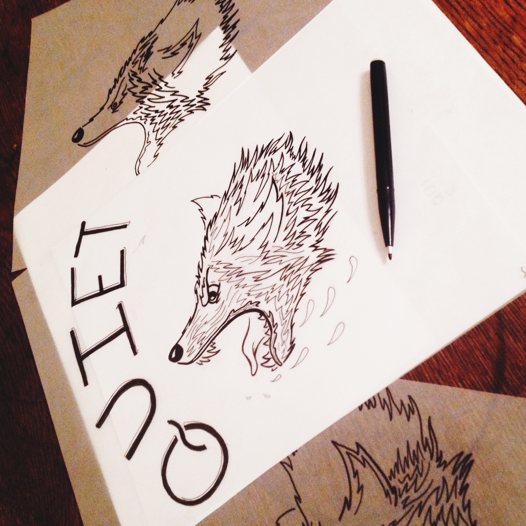
Original Illustrations. Rough sketch of typography to see how the illustrations matches type.


Scanned illustration and bringing into the computer to polish up. Left is original scan, right is progress on the cleanup of the linework. Thinking of inverting the illustration to have more weight on the garment. Interesting in going with a Raglan style tee with dark sleeves.
Motion Collaboration
I had the honor of collaborating with Swedish motion designer, Markus Magnusson on a very fun motion series. We created a set of 6 animations – each telling the story of a congrats gesture – high five, fist bump, jazz hands, bow, handshake, and bear hug. Here's a peak at the high five which was recently featured by Dribbble.
Make sure to check out the rest of Markus' motion work here
Role: Art Direction, Character Design
Agency: Juxt
